We see quilts in old tile floors. We see quilts in stained glass windows. We even see quilts in patchwork fields of wheat and corn.
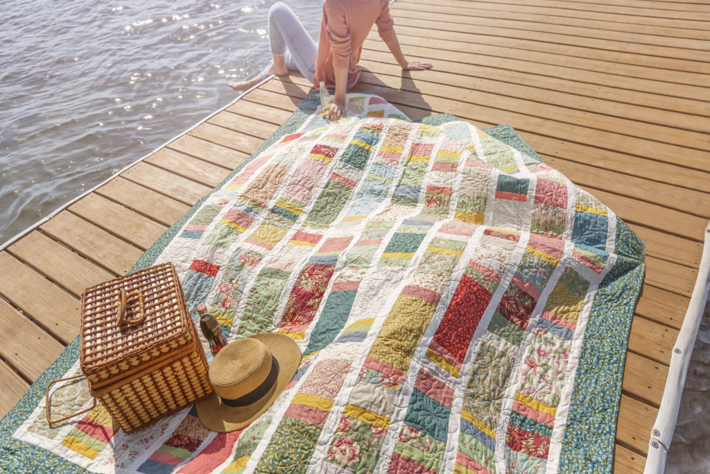
This week, Jenny is stitching up a new layer cake quilt inspired by childhood memories of the California Coast.
You see, when Jenny was a little girl, her family loved to visit the beach at Santa Cruz. Even now she can picture that beautiful boardwalk stretched across the sand like long, pieced strips.
Click HERE to learn how to whip up this show-stopping strip quilt with quick and easy sashing!
Summer is just around the corner, so don’t leave your creativity behind as you embark on your summer vacations! Just because quilting is often seen as a home-based activity, that doesn’t mean there aren’t projects that you can work on from the road. Even if you don’t enjoy bringing your work with you, take the time to immortalize your summer travels with a brand new Summer Travel Project!
From Destination Panels from Riley Blake to the Road Trip quilt from Missouri Star, we’ve gathered some of our favorite summer travel projects to share with you. Whether your sewing from the comforts of home, or stitching on the go, be sure to always share your creations with us by using #msqcshowandtell on Facebook and Instagram!
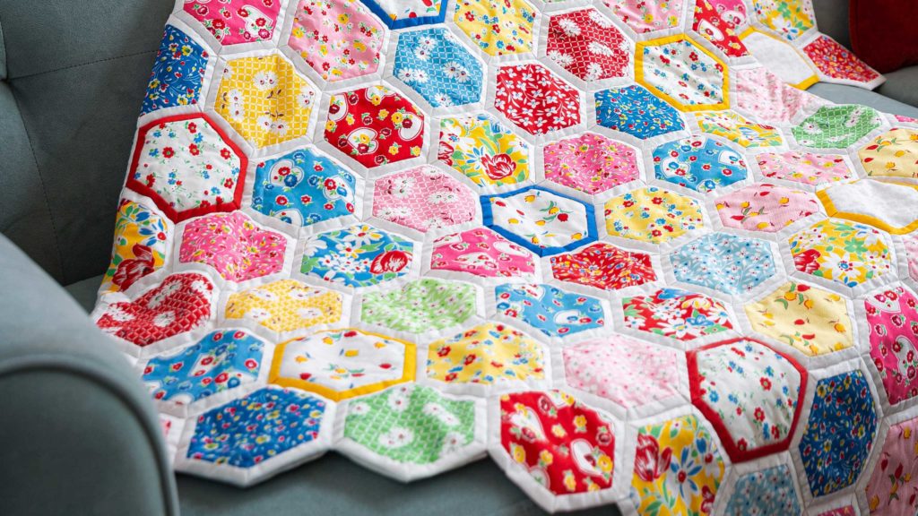
The Quilt As You Go Hexagon Quilt from Missouri Star Quilt Co.
Is there a more perfect travel project than a Quilt as You Go Hexagon quilt? This revolutionary project is made easy with the Quilt As You Go 2 1/2″ Hexagon Template designed by Daisy & Grace which allows you to play with your fabric and fussy cut designs you’d like to feature. To finish, you can either hand stitch or machine stitch these beauties. Not only does this create a beautiful and unique finished quilt, but it makes quilting while you travel SEW much easier!
This template fits perfectly on a charm pack (you’re definitely going to want some coordinating yardage for the backing though as it’s slightly larger!). Go big and go bold with this project because it is bold in it’s design. Consider a Kaffe Classics Prism Charm Pack by Kaffe Fassett for FreeSpirit Fabrics for your 5″ squares. Not only will these colors be vibrant, but they’ll blend perfectly together to create an eye-popping, unique quilt!
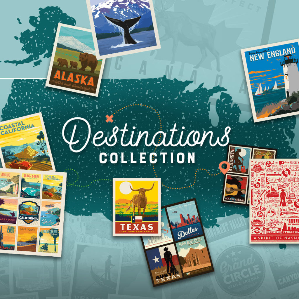
Quilting on the road isn’t for everyone. Some of us enjoy the organization and peace of our home quilting studios and don’t wish to be bothered while we’re out experiencing everything this world of ours has to offer. Instead of working while you’re going, show us where you’ve been with this jaw-dropping fabric panels from Riley Blake!
The Destinations Collection features postcard style panels in an Art Deco theme highlighting popular travel destinations from around the world. Whether you’re stitching up a quilt highlighting all the national parks you’ve been to, or a beautiful pillow featuring your hometown, The Destinations Collection allows for a quick and easy project that will be a favorite for years to come!
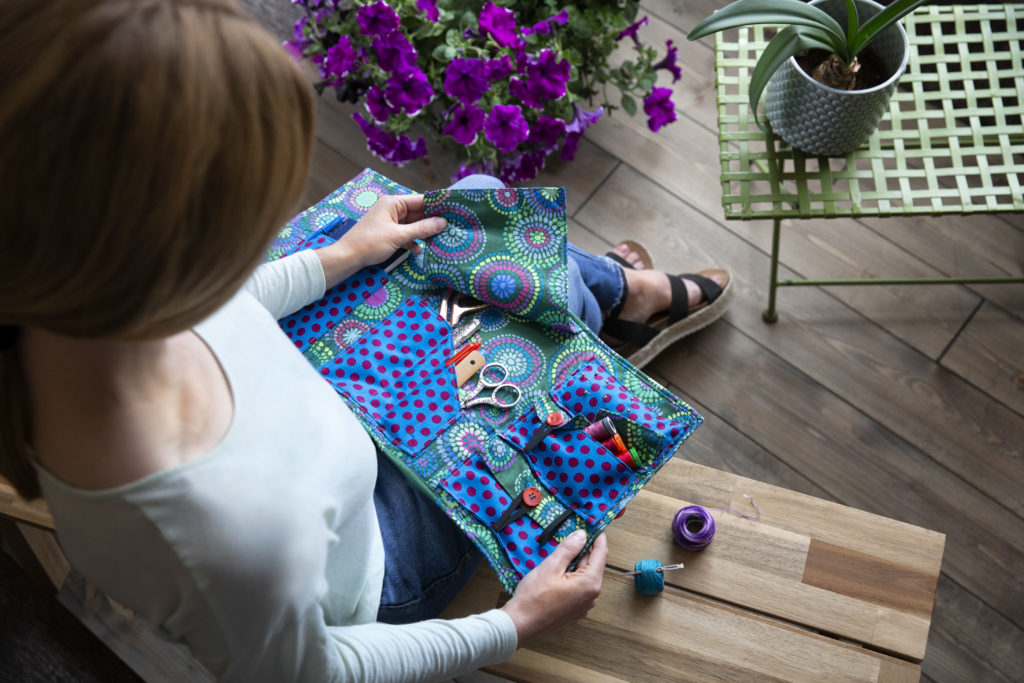
The Sew on the Go Pouch from BLOCK Volume 7 Issue 3.
For those of us who prefer a little organization, the Sew on the Go Pouch is the perfect compliment to any summer vacation. Whether you’re traveling on your own, or attending a sewing retreat (think of how handy this would be!) this cute little custom-made pouch holds your most important notions and tools of the trade.
This BLOCK Magazine exclusive is featured in Volume 7 Issue 3 and comes together with ease using no more than a few yards of scrap fabric. While this perfect stash buster will help eliminate your growing fabric supply, you can also create this project as a gift featuring a favorite fabric of a friend! Pick up some fabric by the yard, such as the beautiful Curiouser and Curiouser – Baby Buds Daydream Yardage by Tula Pink for FreeSpirit Fabrics and create a long lasting and frequently used gift for the quilter in your life!
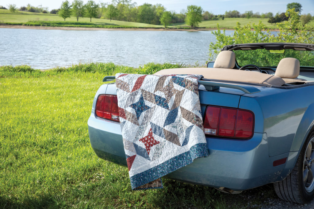
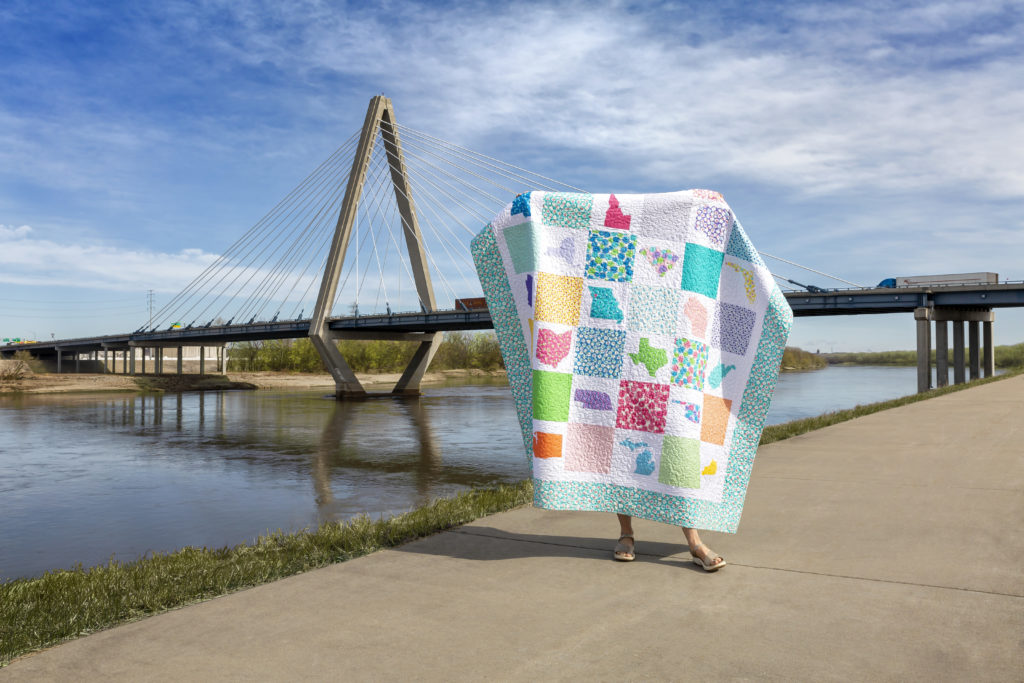
Planning a cross-country drive this summer? Show off your journey with the Road Trip quilt! This gorgeous pattern allows you to document your journey with easy to print state applique shapes. Even if you aren’t traveling this year, stitch up a simple pillow using this pattern to commemorate your favorite destination.
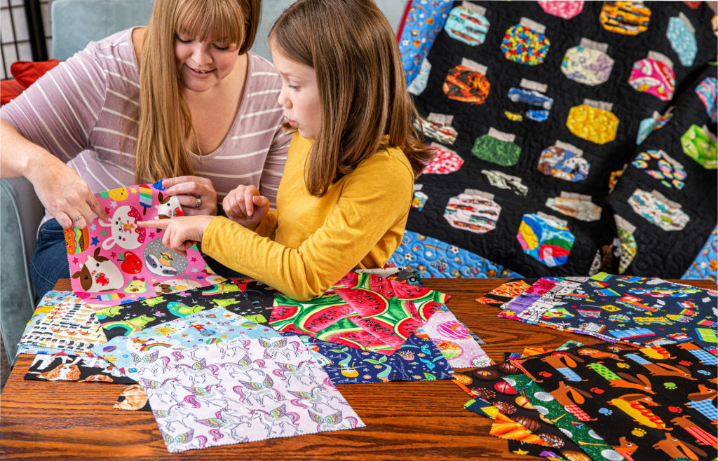
I spy with my little eye, your next quilting project! Do you have memories of playing the “I Spy” game in the car? Road trips in the summer are all about fun, so bring back this great summer travel memory by creating an I Spy Jar quilt featuring found fabrics from your travels!
You’ll need charm packs to create this fun travel friendly project. If you’re at home and ready to get sewing, consider a kid-friendly fabric that’s full of different elements to point out such as Unicorn Kingdom 5″ Stackers by Shawn Wallace for Riley Blake! Make memories with your children or grandchildren by playing a game of I Spy at home with the quilt as your guide. If you are traveling however, pick up fabric on the way! Stop in at local quilt shops or repurpose some old T-Shirts for a truly unique project that captures all the great memories you made.
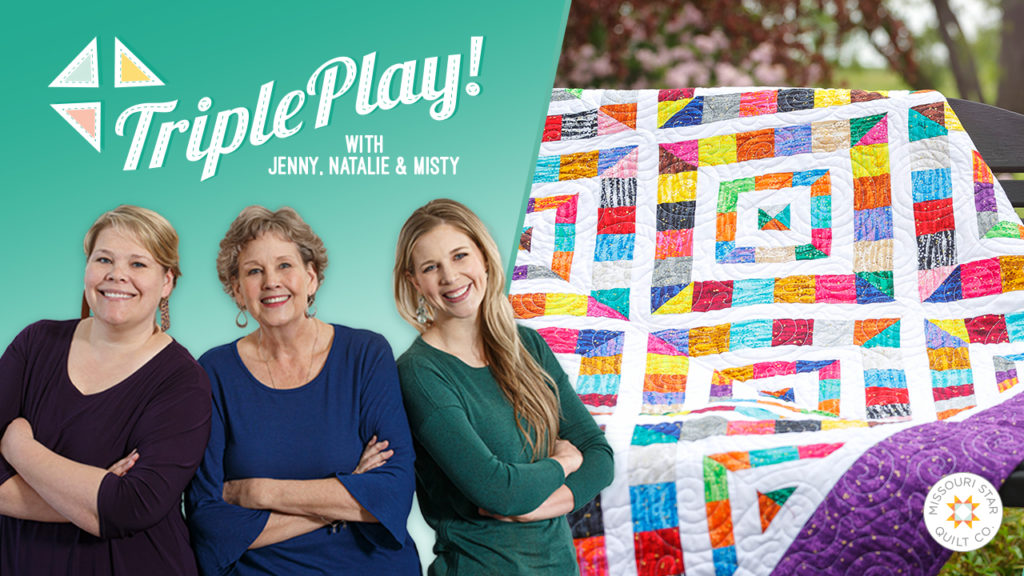
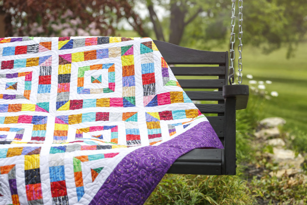
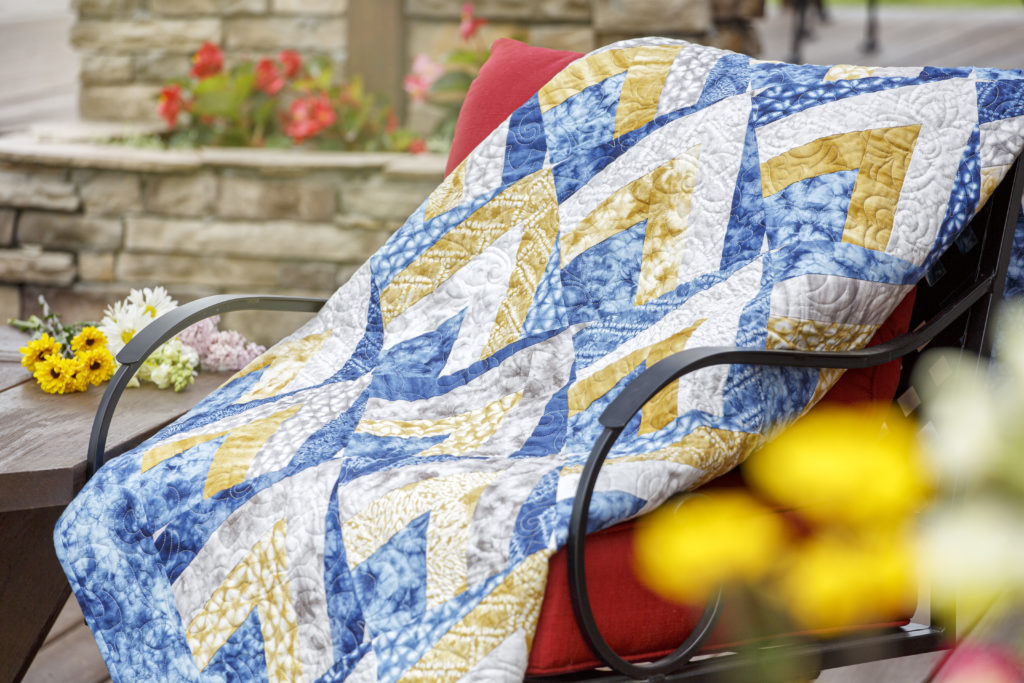
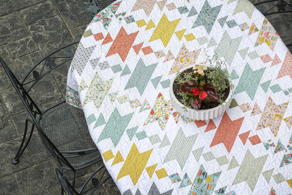
Join Jenny, Misty and Natalie in an all new Triple Play featuring three unique patterns utilizing 10″ papers.
In 1899, an unknown quilter began stitching fabric scraps on a paper foundation. Alas, the quilt was never finished. (It happens to us all!) The incomplete top is on display at the Virginia Quilt Museum, and the paper is still intact.
For this month’s Triple Play tutorial, Jenny and the gals designed 3 foundation paper pieced quilts using our favorite new jelly rolls and layer cakes.
Each quilt is made with Missouri Star 10” Paper Piecing Squares, which don’t have the mystery and romance of 19th century correspondence, but they’re SO easy to use! See how simple and fun foundation paper piecing can be!
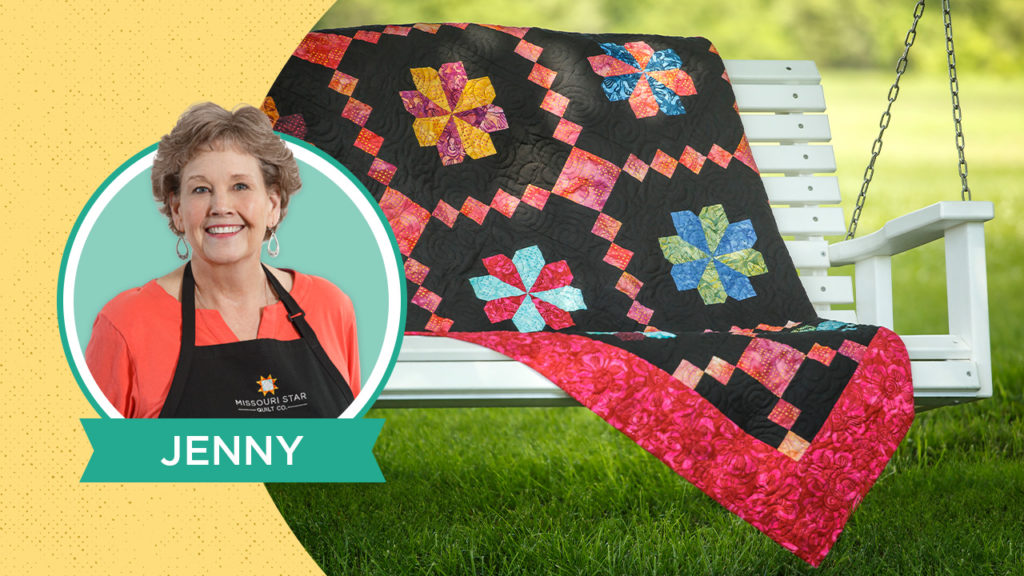
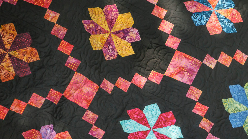
In 1825, 14-year-old Jane Valentine started an Irish Chain quilt. Five years and 10,092 blocks later, her quilt was finally complete.
According to the National Museum of American History, Jane used 130 different cotton prints and a plain white background that is quilted “6 stitches per inch with a flower motif.”
(Keep in mind, every one of those tiny stitches was done by hand. No wonder it took 5 years!)
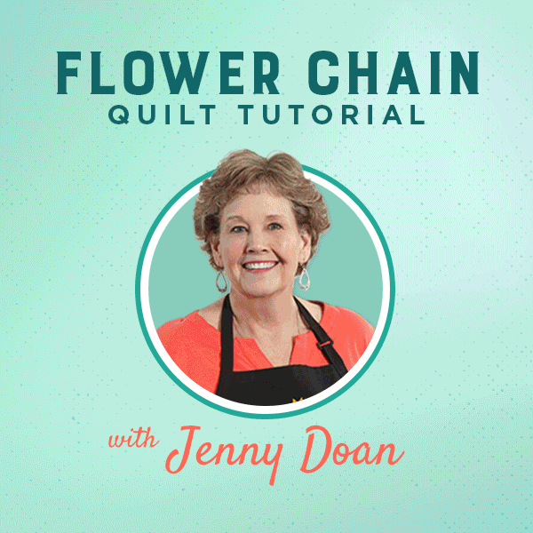
This week Jenny whipped up a new version of the Irish Chain based on our quick and easy Irish Change pattern. The addition of a sweet little flower block makes this Flower Chain quilt an absolute beauty!
Grab your favorite charm packs and click HERE to watch the tutorial!
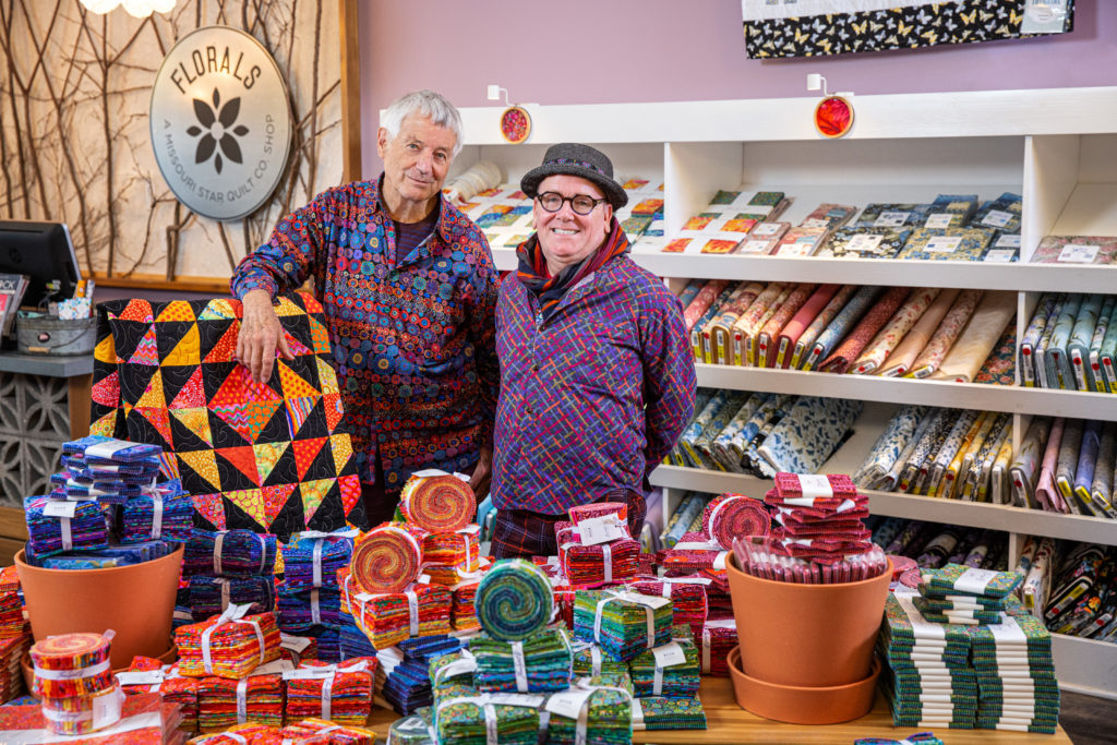
Kaffe Fassett and Brandon Mably visit the Florals shop in Quilt Town, USA – 2019
Color is king when Kaffe Fassett comes to town! In 2019, we were thrilled to host the world-renowned color guru himself at a workshop and a lecture highlighting his latest projects. It was a feast for the eyes to see the Kaffe Fassett Collective’s designs up close and personal and our fabulous social media manager took a moment to sit down with Kaffe and Brandon Mably to chat about the sources of their inspiration and how they are able to collaborate so seamlessly together. These two amazing guys spoke candidly about their personal influences, the joy of teaching and learning, and how they intend to spread a love of color throughout the world!
You’ve been designing for decades. What eras have called to you the most? And maybe the least?
Kaffe: I would say, probably the most influential in my life was the “hippy” times. You know, I arrived in England in 1964, when the Beatles were just bursting onto the world. And so they encouraged us all to go down to the flea markets and vintage shops and buy wild doorman’s uniforms and make our clothes out of Indian bedspreads and god knows what. You know, there was a freedom of fashion and so forth, so that was an incredible time. I would say that’s probably the most influential event, that freed me up to just make myself up, reinvent myself.
Are there any eras that didn’t provide that inspiration?
Kaffe: I didn’t like when I went through the 50s, because I felt it was very stodgy and conservative. Because, you know, if you grew your hair more than a quarter of an inch longer than everyone else, if you met someone they’d say, “Why don’t you get a haircut? What’s wrong with you?” It was very annoying. You couldn’t be yourself. And that’s why I suppose that hippy time was so important because you could totally be yourself. But I look back at it now and I realize there was a lot of color … all the sort of pastel colors. I mean, it’s interesting when you see a revival of that time that they don’t get the color right. They don’t get enough pink and duck egg blue, all those wonderful high colors; the girls in canary yellow, twinsets and pearls, scarves, and their big, flowing skirts, all that stuff, it was interesting. The thing is, those poor girls, their hair had to be absolutely perfect! If it was in a bob it had to curl under, not a hair out of place, it was very plastic. So, there was a lot of stuff I didn’t like about that time.
And Brandon, how about you?
Brandon: I’m not old enough to have opinions about that. You know, for me, if it doesn’t move fast enough, I’ll grab it. I’m looking for a play on color and pattern and rhythm, and because Kaffe is more into Rococo and brocade and flowers, and I’m more about the repetition of markings, it could be chewing gum stuck to the pavement, it could be a zebra pattern, you know it’s what’s going to make dance and movement and pattern, and they all feed my imagination, but it’s never one thing. One thing will lead to another thing, so it’s never a direct take.
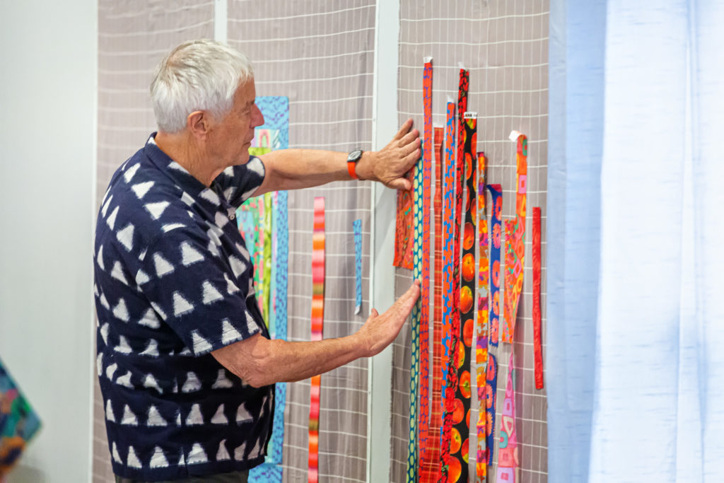
Kaffe displaying fabric strips on a quilt wall.
How do you see color evolving?
Brandon: We’re changing. Because in the past we were working with a lot of saturated color, but now you’ll see the fabrics coming out from ourselves have a little bit more edge and a little bit more contrast so when you cut up the fabrics, they give you a little bit more flicker, a little bit more play, rather than being more of a saturation. You will still have that color saturation, but it’s different, and also the patterns and structures that we’ve been inspired by having a little bit more contrast rather than a dense pattern. So, we’re changing all the time and we’re learning from our workshops, other people in our classes inspire us.
What insights have you garnered from people who have taken your classes?
Kaffe: Use of black and white is the strongest thing. Just people doing wonderful, contrasting things ‘cause that never used to be part of my vocabulary so much. I think what I’m trying to do always is to get clearer. I see a lot of my fans will take all of my big flower fabrics and Phillip’s big flower fabrics and put them together and end up with something very mushy, kind of chop suey. And so I try to get more clear and a little bit more definition in my pieces so you can actually see the structure. So, I suppose that’s what’s come out of the classes, really.
Is there a benefit then from using precuts where the collection is completely packaged in one?
Kaffe: It would never occur to me to pick up a package of something and try to make it work. One of the things that we do in our workshops is have people have a huge variety of fabrics to choose from and then sort out the ones that are disturbing the peace as it were, not making the color glow. It’s very difficult to do that if you’re very limited by somebody else’s choice of fabrics you should use. But, you can take anything and make it work.
Brandon: But the prepacks are fantastic for those who are a little bit intimidated by making a choice in so much color and pattern that they’re not used to.
Kaffe: Anything that gets people started, gets you going, is fine with us. Then they can come to one of our classes and refine the whole thing.
You’ve mentioned something about using blacks with the colors and how the white kind of drowns out the color of the fabric.
Kaffe: Well, I wasn’t saying using black, but I would use … I’ve just done a whole range of shot cottons that are quite subtle colors. Those kinds of colors go beautifully with the more florid, expressive colors of flowers.
Brandon: I mean, every color has its place, but white steals the intention from color. Black attracts and pushes color forward, more than what you possibly needed unless you control a color. Lots of shades of whites can be beautiful, lots of shades of darker tones and blacks can be beautiful, but put those with neon colors, they’re gonna fight.
Kaffe: What white does is overshadow the color and, very often, rather than helping it to glow. And that’s what our whole thing, what our workshops are trying to get people to do is to make color be released and have its full potential. Billions of people in the world think white is a wonderful background for fabrics and we just are there to differ with them.
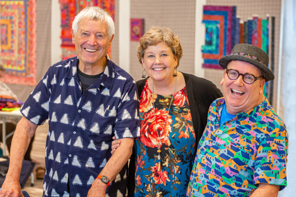
Jenny visits with Kaffe (left) and Brandon (right) during their 2019 visit to Hamilton, MO.
That’s a great experiment though too, right?
Kaffe: You know something, I think you learn as much from what doesn’t work. Okay, now I see that. I never need to do that. I can see that that blend doesn’t work. It doesn’t do anything for the color. So, good. Now I’ve seen all those quilts. I can just go and do something different.
Brandon: We will never stop learning because color is so unpredictable. And it’s not about a theory or a color wheel or a process. Neither of us had any education about color. But what we’ve done is we have a level of confidence to allow ourselves to make mistakes and learn from that.
And what would you say to people who maybe struggle with allowing themselves to make mistakes?
Kaffe: There’s a great fear of getting color wrong. Our whole lives are experimenting and playing with color. We got past that fear.
Brandon: People judge themselves too harshly. One of the big lessons that Kaffe taught me at the very beginning is “have a go. Just try. Keep on trying.” But also if you don’t like it, guaranteed somebody else will. So stop thinking you’re making it for a particular reason. Just enjoy the process and see what comes out of it.
You both experiment with art and creating in different mediums, how do you think that helps you when it comes to designing fabric and working with textiles?
Kaffe: Everything we do is experimenting with color. If you make a bouquet of flowers, if you throw cushions onto a couch, if you choose wallpaper, or whatever. Basically, what we’re doing is making mosaics, we’re making rag rugs, we’re designing fabrics, we’re making quilts, we’re doing knitwear, we’re doing needlepoint—it’s all playing with color. And then we have exhibitions which make a great kaleidoscope of groups of colors, so that that really has a dramatic, theatrical impact to the people that come to that museum and see our shows.
Brandon: It’s an incredible journey what we’re on because we basically hand paint all our artwork, nothing is done on the computer, then it goes off to Charlotte, North Carolina, then it’s sent out to Korea and it comes back in fabric form. And then we get to cut it up and then rearrange that on our design wall into a large scale arrangement and that gets sewn, instructions are written, and then we go out to a lavish location and photograph that. And we choose aesthetic locations that the whole thing has a harmony.
Kaffe: The location actually reflects the color that’s in the quilt.
Brandon: So we’re completely controlling the look. And there’s play, play, play, play, and we never have a plan, until even the photoshoot, we’re living by the seat of our pants. That’s why I have no hair! I used to be a long, blonde, curly-haired, Tarzan-looking, gorgeous George. But look at me now!
With the books, like Quilts in America and Quilts in the Cotswolds, were those unplanned?
Brandon: We go and go a 2-day recce (reconnaissance). So, we access a place. And then we go back. We don’t know what the weather is going to be like. We know what time of year it is. We haven’t got the quilts made. They’re still being given birth to until the week we fly away.
Kaffe: I mean so much so that one of our locations was a fabulous park full of incredible tulips in Holland and we said to them, “Can we come and photograph here tomorrow?” and they said, “Absolutely!” But overnight they cut every flower down in the entire park. And you forget to ask questions like, “ You’re not going to cut your flowers down, are you?” They thought we were coming to photograph black earth, I guess. Because that’s what we had. So we said, “What have you done with the flowers?” They said, “They’re dumped out in the back.” So we took the girls out and threw the models down on top of dead flowers. And that was our shoot. That’s how unplanned it is.
Do you design separately and then come together?
Brandon: Yeah. I mean, we’re in the same space. We’re just in different rooms.
Kaffe: We encourage each other in our designs.
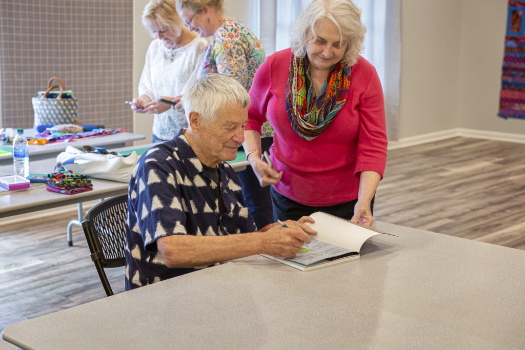
Kaffe signs an autograph for a fan during his 2019 visit to Hamilton, MO.
Switching gears a little bit, about how long have you followed Jenny and the Missouri Star story?
Kaffe: Well, I heard about this story. They said this woman in the middle of America has become the businesswoman of the year and then this mythological thing of how it all came about. You know, it’s just amazing. It’s an extraordinary story. Is somebody writing her story?
Social Media Manager: We’ve documented it a few times, but to sit down with her and create a book like yours, we should totally do that.
Kaffe: Totally! Because that’s a great, great story. We came here very curious to see the spot where all this happened.
Brandon: We heard about it at the Houston Quilt Market, it was like a virus, everybody was talking about it, and how this online, educational website was also selling and it was just bringing more interest to the world and how it was kind of encouraging more people. And then we started to hear when they were taking over a town and introducing shops and we didn’t think it would be as together as it was. We thought there would be a shop here and a shop there, you know. It’s not always you can buy a high street (like a main street), it just doesn’t seem possible. So, when we were brought up from the airport, we were driving, driving, driving, we were thinking, where the heck are we going. And then we saw a big, billboard sign saying “Quilt Town” and we were like, hey!
Your designs and your creations resonate with people from old to young, beginning to advanced, why do you think that is?
Kaffe: First of all, there is a big nostalgic element to the way I design. I look at the world of decorative arts: old carpets, old wallpaper, old things, so there’s a big nostalgic element to that. Brandon’s far too young to have any nostalgia, so he produces these very funky, modern, kind of primitive, exciting, geometric designs that work very well with our, Phillip’s and mine, kind of very floral, painterly fabrics. So, there’s a great combination, but I would say that more than anything else, that it’s the color that has grabbed people. For some reason, the quilt world was so enveloped in past history that all the color was browned down. So, we had a lot of browns, ochres, you know, pale creams, and everything kind of had milk in it or earth in it. And I wasn’t into earthy colors. To me, when I travel the world, I see Gypsy caravans, and I’m very attracted to circuses and fun fairs, and, you know, vulgar, crazy bright colors. So, I love all that and I put that into my fabrics. And Brandon does too. His color is vibrant.
Anything you would like to add?
Brandon: Absolutely. I totally agree. I think a big part of why our audience is wide is that it’s a collaboration. There’s three artists involved and Phillip is an extraordinary painter, but it’s Kaffe’s colors that are what people see. It’s very rare that Phillip’s actual, original artwork is seen by the public, and colors, because he doesn’t do colorways, and then Kaffe puts the magic into those. And then he does his own colors. And I kind of give them a little bit of separation or space. They call me “zany”—I should change my name. And yeah that appeals to those who want to be a little bit more daring. And there are those who, if they can’t cope with my wacky contemporary, they can lean more towards Kaffe and Phillip. And so it’s a very good blend.
Where do you see quilting and creating evolving in the next 5, 10 years?
Kaffe: As we have taught over the years and traveled, we see people improving unbelievably, so that our workshops now, there’s nobody that falls through the net. Nobody that doesn’t actually make it to the end of the project. They may have a fragment of something, but they’ve got something up there that tells us the color they’re doing. And so, I would see improvement, improvement, and that people seem to be getting much more our message about how color can be vibrant and sexy, rather than contrasting and edgy. You know, it’s like the formulas of white backgrounds and contrast. When I first came into the industry, this woman said to me, “You have to understand about patchwork, if you’re going to get into it. There’s three elements: there’s the light and the dark and the medium, and you have to have those elements always in a quilt.” And so there are these formulas that people go by, rather than, what makes that color suddenly come alive? So, I would say it’s improving and I have great hopes for the future because every year that we go out, every set of workshops we do, they get better.
Brandon: I believe, I think we’re in a world of education. Missouri Star is a huge part of that by Jenny giving her tutorials, and I don’t think a shop can exist without giving workshops because what you’re doing is, you’re encouraging your customers to be a little bit more adventurous, try something new and daring and step out of your comfort zone. So you feel a little bit more open. So yeah, I think it’s our responsibility to get people to just try and, not just scare them, but try to get them to be a little bit more daring.
We’re so proud to announce that our Missouri Star Starlight Block of the Month quilt will feature fabrics from the Kaffe Fassett Collective prints. Click below to learn more about this exciting new BOM and get stitching with the master of color himself!